
City of Bartlett Parks & Recreation Branding
/
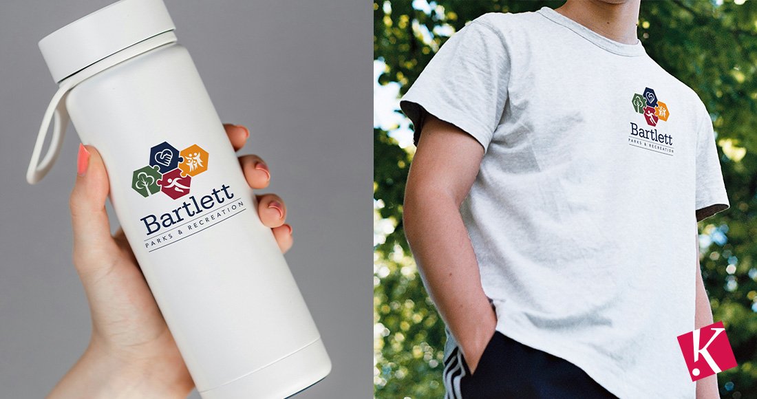
Kelley & Associates provided a new brand for the City of Bartlett’s Parks and Recreation Department.
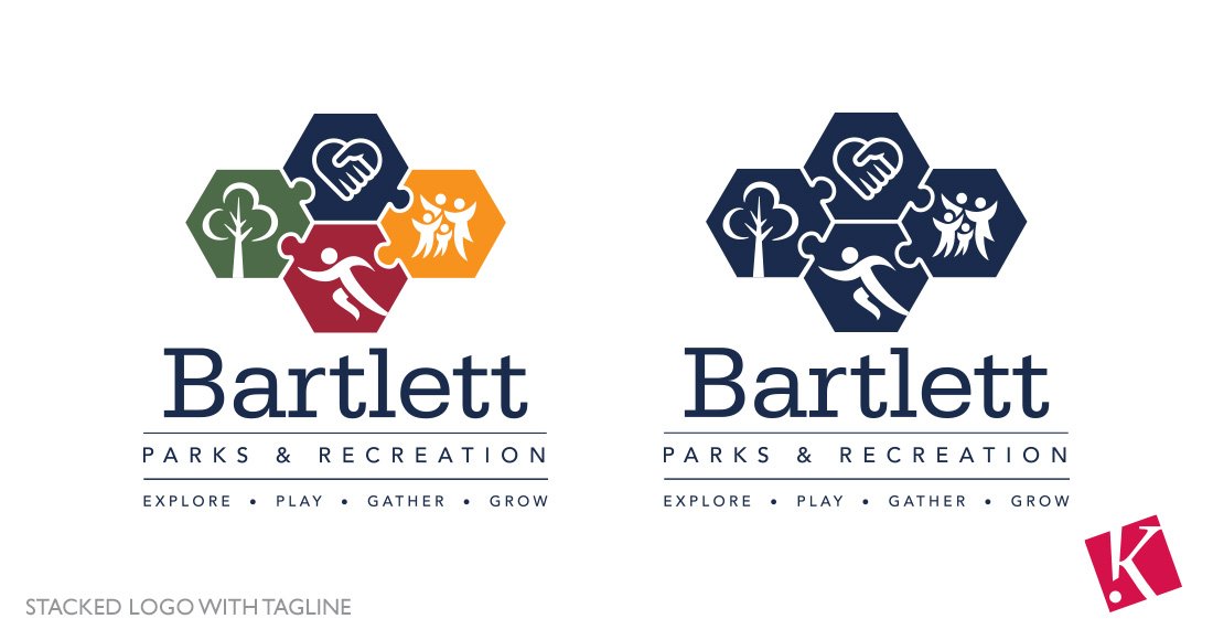
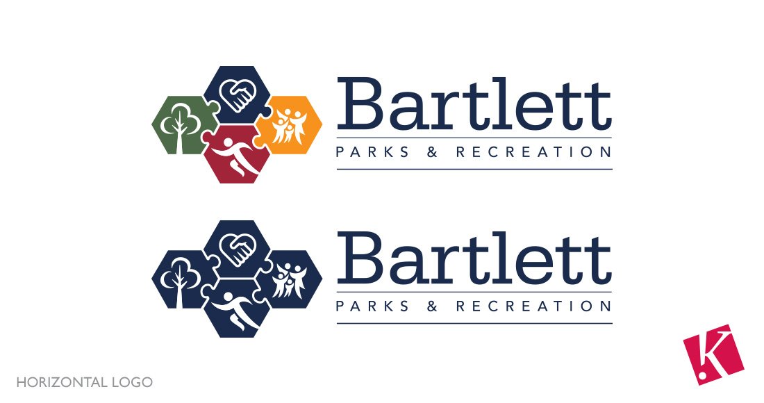
The newly designed logo for Bartlett Parks and Recreation is a reflection of its commitment to community, strength, and nature. The logo incorporates four hexagons connected to one another like a puzzle. Each hexagon contains an icon that symbolizes the core values and the services provided to the Bartlett community. Each element works together as a whole to bring fun, quality recreational opportunities to the residents of the City of Bartlett.
Why Hexagons? The use of hexagons in the logo is intentional, symbolizing transformation and the journey associated with it. This shape is commonly associated with strength and efficiency, seen in nature in structures like honeycombs and turtle shells, representing Bartlett Parks and Recreation’s commitment to resilience and sustainable development. Hexagons provide a visually refreshing look, distinct from the conventional circular or square shapes. Their unique appearance helps the logo stand out, reflecting the innovative approach to parks and recreation.
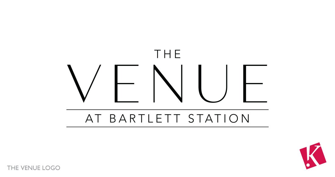
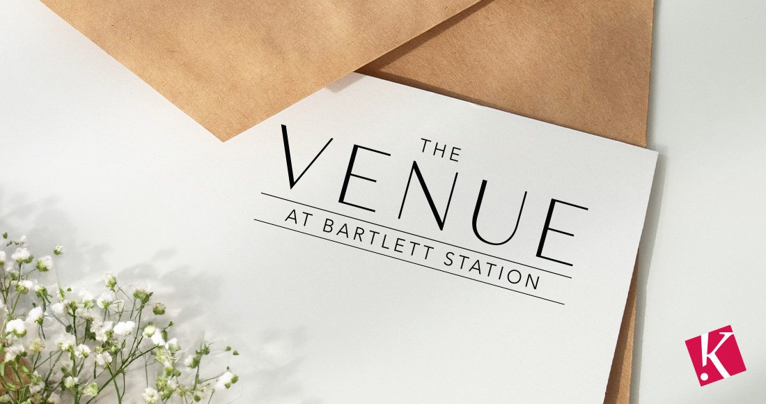
As a part of this branding project, Kelley & Associates also created a logo for The Venue. The logo needed to be adaptable to various contexts, reflecting the facility’s diverse use for different events, from intimate gatherings to grand banquets. By choosing a clean, minimalistic design, the logo communicates professionalism and sophistication, ensuring it resonates with a wide range of audiences, including individuals planning personal celebrations and corporate clients seeking a polished space for meetings or training sessions.